Project Brief
The previous version of www.designdpi.com, scarily, was launched towards the end of 2011 and we've been wanting to update the website every year since. The old logo we'd had since 2001, so when we were finally happy with the new look, any spare second we've had has been spent on the new website design.

Concept
The main drive behind the rebrand, other than a tired old logo and dated website, was for a playful design, something a five year old could easily relate to. After all, that's what it's all about. The logo was designed to be relatable to a five year old while at the same time being creatively corporate, relevant to both print and web design.
Hopefully we've achieved this with the rebrand. A logo which has evolved naturally, one which is both modern and stylish, one which conveys who we are and the principles which design dpi believe in.
Old Logo Design
(2001 - 2018)


New Logo Design
(2018 - present)


Brand Guidelines
The previous logo was very much influenced by the offset printing colours cyan, magenta, yellow and black. Although a softer magenta is still the primary colour used for the brand, we've added new colour variations which can be used both online and offline.
-
French Rose
HEX: #EB4897
-
Maya Blue
HEX: #67CAFA
-
Festival
HEX: #F6CE46
-
Chelsea Cucumber
HEX: #88AD48
-
Blue Violet
HEX: #9345F7
-
California
HEX: #E8883D
-
Toledo
HEX: #2E2026
Web Design
It's not a bad problem, being too busy on client websites and not having any time to update or work on your own. However, at 8 years old the site really was in desperate need of an overhaul.
We've had a design and several elements for the new website planned for years in the mind's eye, but of course, we're our own toughest customer. Taking this into consideration, along with the time constraints and a healthy case of OCD has meant this new website has been 3 years in the making.
They say that good things come to those who wait, and that's certainly the case with this new web design. Stealing a half hour here, an hour there. Usually at the end of the day, in the evenings, weekends. We've been steadily crafting the new site, collating the content, writing copy, creating images, coding the design. No stone has been left unturned.

Mobile Responsive Design
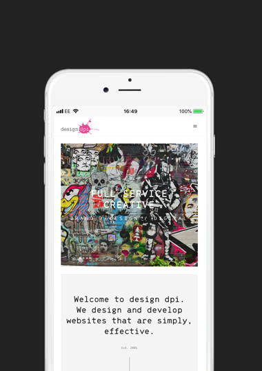
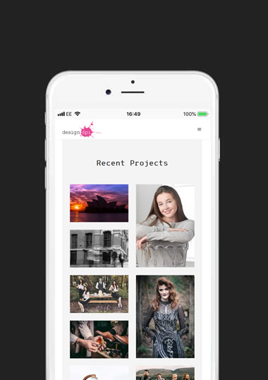
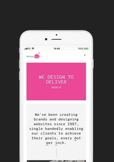
It's truly mind-blowing to think, as groundbreaking as some of the code used on the old site was when first launched, just 8 years ago designing for mobiles was still kind of an after thought. Now, it's second nature to design with every device imaginable accounted for.
Print Collateral
Not only have we treated ourselves to a snazzy new logo and amazing new website design. We've also totally revamped all our marketing materials, email signatures, business stationary, including business cards. Take a look, here.
Final Thoughts
We really should have started this overhaul years ago. The new site is a complete contrast to the old website. Finally, after years of procrastination we have a brand and a website we can be proud of, one we can shout about!

David Ellicott // Director
If you've read this far, thank you! If you've read this, then you're AWESOME! This is just a little nod to the old website... quote "Bill 'F***ing' Murray" to receive a discount on ANY service =^..^= This isn't so much a testimonial (how could it be), it's more of an admission. Throughout this website, design dpi, we use the plural first-person pronouns of "we" "our" "we're" when in reality, it's just me, myself and I. I'm the designer, developer, server administrator, you name it. 22 years experience and counting, why not find out how I can help your business?
www.designdpi.com


