Project Brief
We were approached to basically take over everything. The web design, the website hosting, but also, to refresh the branding. Branding that would be used across all mediums, including signage on the shop windows. How cool!

Concept
There had been a very simple holding page in place when we got involved. Our job, was to secure the domain and liaise with the previous designer, in order to get things set up for a migration to a new server. Which didn't take long at all being such a simple one page holding site.
That said, the old site had disappeared into the ether with the previous designer, so our main priority was getting a prescience reestablished as quickly as we could for the client.
Branding

Brand Guidelines
The main typeface for the logo is the fancy retro font Odalisque. The overall logo design does it's primary job of not only looking good, but immediately conveying what the business is all about.
-
Charcoal
HEX: #424242
-
Arrowtown
HEX: #837B6F
Web Design
When we were asked to come up with a logo for the website, we genuinely had no idea the logo design was going to be used on the shop front of a very busy street in the heart of Sheffield.
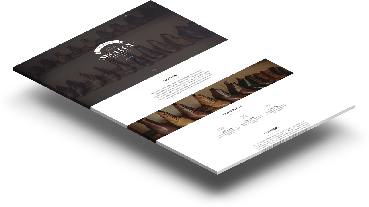
We always try to keep in mind how potentially the logo might be used, so in this instance it translates really well to a shop window, but it looks equally as good set out monochrome. In the case of the web design, we used the single colour white version to good effect on the websites homepage.

Mobile Responsive Design
Sed ut perspiciatis unde omnis iste natus error sit voluptatem accusantium doloremque laudantium, totam rem aperiam, eaque ipsa quae ab illo inventore veritatis et quasi.
Export
Sed ut perspiciatis unde omnis iste natus error sit voluptatem accusantium doloremque laudantium, totam rem aperiam, eaque ipsa quae ab illo inventore veritatis et quasi.
Detect
Sed ut perspiciatis unde omnis iste natus error sit voluptatem accusantium doloremque laudantium, totam rem aperiam, eaque ipsa quae ab illo inventore veritatis et quasi.


